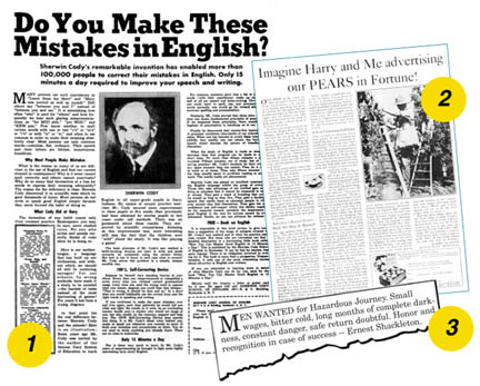
any furniture retailers are finding it very difficult to gain a competitive advantage over their competition these days. Overhead factors are a wash; payroll and merchandise costs are comparable; rent, lights, and so forth are fixed. But, what if you could buy your newspaper space and your direct mail for about half the price of your competitors? You’re right, it can’t be done. But, what if you could make your print at least twice as effective as your competitors? This article offers you ways to do exactly that.
Part of the problem is that fewer and fewer ad people are trained to create effective print advertising. Ad people find making TV commercials far more exciting than making ads for newspapers or working on direct mail. Also, TV and radio commissions are built right into the rate structure, and this makes for a bigger payoff. Another part of the problem is that newspapers are hard as nails to do business with.
I should pause here and answer the question that may be forming in your mind: "How do these so-called greats know what is effective and what is not in a print advertisement?" Good question. The answer is that Ogilvy, along with Clyde Bedell, John Caples and a host of other ad-persons spent a fortune testing and researching ads. They used Gallop and Robinson, Starch Readership Service, and direct-response statistics. Over a period of time it became possible to isolate certain principles that could effectively multiply exponentially advertising response. Direct response advertisers, such as Land’s End and Sharper Image know these principles. They have to, or they’re out of business. Few furniture retailers even know that these factors exist, and not many advertising agencies understand them. It takes time to learn them, guts to stand by them, and experience to master them and make them work. So billions (yes, billions) of dollars in retail advertising is wasted each year. If you are tired of contributing to that waste, read on.

These Great Old Ads Teach Important Lessons:
1. WORK ON YOUR HEADLINES: This ad (above left) was considered a failure until a single word was added to the headline. Figure out what word it was and why it virtually forced readers into the copy.
2. "ORDINARY" PEOPLE SELL: The headline for this ad was created when the two farmers, known only as "Harry and David" sat in the office of famous ad man G. Lynn Sumner one day. The two farmers from Bear Creek Orchards in Oregon had sensational success selling their pears at Christmas time. Now they were going into national advertising, and they needed a headline. David was looking out the window and said: "Imagine me and Harry advertising our pears in Fortune magazine." A great headline was born. The truth is, some of my best headlines have come from the mouths of furniture folks who just happen to let the words roll out. Real words from real people sell. So do photos of real local managers and store owners. People like to see an image of who is doing the talking.
3. This little 1900 classified ad was brutally honest. The result, according to famed polar explorer Ernest Shakleton: "it seemed as though all the men in Great Britain were determined to accompany me, the response was so overwhelming:' Moral: When you are overstocked or have some other problem, just tell it like it is. Honesty sells.
Most Newspapers Make it Very Hard
One big reason for this is the lack of competition. If you don’t like the newspaper’s attitude or rates… it is tough! You have no where else to go. Another serious problem is that newspaper sales representatives are not given the training that they need. They don’t know much more about what makes ads work than their clients. It isn’t that most newspaper reps don’t care to know, it’s just that newspapers won’t invest the money necessary to train them. A third reason is most newspapers’ rates are far out of line. They are driving advertisers out of their pages. However, there are some newspapers that are aggressive and willing to offer some dramatic discounts to advertisers who are willing to use their product on a regular basis. Keep in mind that even though newspaper management may have difficult attitudes and tedious rules, most representatives are very willing to work with retailers and help them.
Print: Your Best Opportunity for Bigger Market Share
This big opportunity has been proven to many doubtful retailers who made a claim along these lines: "Well, our newspaper doesn’t work." The newspaper does work, it provides you with white space and delivers the message you put into the white space. But if you run look-alike ho-hum ads, don’t expect return. As was stated in the February/March issue of FURNITURE WORLD: do not buy $1,000 worth of ad space and put $10 worth of effort into filling it.
Print Advertising Effectiveness X2
Years ago I became an Advertising Manager for what was then the largest furniture store in America, Curtis Bros. I began to study the craft, and learn about copy. The changing of a single word in a headline can make the difference between a bomb and a spectacular success. See the exhibit on page 75 and note that the word added was “these.” Being visually dramatic with graphics and persuasive with copy is vitally important. On my own, I tested ad after ad and discovered that consistent use of strong, complete copy with clear and vivid layouts produces much more business and builds credibility in the market. Over nearly three decades I have studied every book written on the subject of advertising (or so it seems). Here is a brief summary of what I have learned.
Tell Your Story in the First Ten Seconds
Although I use lots of copy in my ads, no one has to read it all to get the story. I design them so the reader can answer six questions within ten seconds: Who? What? When? Where? How? Why?
I do this by using visuals that attract the eye briefly and fuse together into a complete story. I have written about this formula before, but continue to receive letters and calls about it. Most people get their information in small bytes these days. The cardinal principle, based upon market research is this:
•Five times as many people will read your headline and sublines as read the entire ad.
The sub-principles are these:
1. Headlines and sublines that carry news are surefire winners. This, of course, is the "what" element in the six questions. Ogilvy suggests using headline words such as: amazing, introducing, now, remarkable, and suddenly. They work, if you don’t overdo them.
2. Headlines and sublines need to be embellished with benefits. Of course. "What’s in it for me?" the consumer wants to know.
3. Headlines that promise special information are powerhouses. See the exhibit in which the single word “these” was added to virtually force the reader into reading the entire ad. Result: a bummer ad was transformed into a classic winner.
4. People will read any amount of copy if it is interesting to them. Bedell once told a client who doubted this (named William Clayton) that he could write a headline that would compel Clayton to read an entire double-truck ad of small print. Bedell scrawled the headline on a yellow tablet: "ALL ABOUT WILLIAM CLAYTON."
5. Be specific. Don’t say: "Big Selection," say "A Million Dollar Selection" …or "Three Floors of the Latest Furniture Designs."
6. Use Quotes when you can. Quotes increase recall by an average of 28%.
7. Include the name of your city now and then. According to tests, people like this.
8. Don’t try to be cute. People don’t have time to figure out obscure headlines. Many of the dotcom’s make this error. Hit them between the eyes. "Blind" headlines (ones that are cute and try to make you curious) have 20% lower than average recall.
The first thing a consumer wants to know, and to know fast, is "What?" This headline or graphic should dominate your ad. It better be fresh, catchy, and effective. Next, "Who?" So you need to identify your store clearly and at least twice in the ad. Your logo should "fuse" with the what element of the ad. But you must go further if you want to attract new customers. "Who?" means much more than just your name. A good picture of you or your manager now and then can do wonders. An illustration of your store is very helpful. Photos are best. People tend to believe photos and doubt artwork. Been in business for a while? Tell me how long, it will help me decide if you are to be trusted. Be sure to identify yourself and weave information about your store through the entire ad. When you are done, it should be impossible for anyone to put their logo on your ad and make it work.
"When?" This is simple enough. After your customer learns what is going on and who is doing it, their next question is when? Give days, dates and hours. On big events, it is impressive to use the year in the date. It is also amazing how often retailers leave their hours off ads. It is also interesting that so many furniture retailers are open at their own convenience, not the working public’s. This is particularly ill advised in the case of rural stores that are worried about local business fleeing to nearby big cities. The successful big city furniture stores are open when consumers can shop, which is evenings for most modern shoppers.
"Where?" Just put your address on the ad… right? No, you should do more. Imagine you are having a party and want a friend to come. You give directions, draw a map, and tell them to "turn left at the big church." So, unless you are in a very small town, drop in a map to help them find you. Not every ad, but often. And give them a locator phrase, such as: "Look for the green awnings" or some such thing. You want them to come, don’t you?
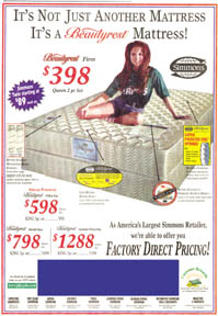
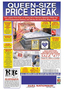
"Why?" This one is often overlooked. "What’s the deal, why is this event so special?" Or "Why is this product so unique?" Everyone wants a deal these days. And, the consumer wants to put off this trip, you can bet on it. So you need a persuasive "buy now" element in the Why component. Many very good ads fail because all the "bases were touched" except for this single critical element. There are only two powerful buy now elements that will trigger consumer action: scarcity and/or a limited time to act. Either you are going to run out of product or you are doing something for a compressed time period. An event of several weeks needs several "episodes" along the way to keep it going. Item-price won’t pull an event along, but a good general selection story will. "Further reductions" is a good line, but make sure it is true. Even if the customer is unaware when you fudge the truth, your people always know. And no one enjoys working for a store that lacks integrity. Aside from buy now, you should weave the benefits of new furniture throughout your ads. Relieve the concern of the woman who is afraid she will buy the wrong thing, or pay too much. Guarantee satisfaction in every way, and keep it a simple and clear guarantee. Don’t let the few nutcases out there predicate your advertising to the general, reasonable public. When you sell mattresses, sell the benefits of sleep and don’t use the factory mats. They are nearly all weak, and are designed to sell product for every dealer in the city, not you. (See the exhibit on page 80). The sum total of all this “Why?” persuasion is a dramatic story that has a compelling theme: the reason to buy new furniture is to make your home more comfortable, more beautiful, and a better place to be. That’s what women really want to hear.
Why do I keep talking about women? The furniture and mattress industries are one of the very few left in which men design the product, men sell the product wholesale to other men, and men retailers display and sell the product to… women! The furniture and mattress ads that compete with car dealers for ugliness and price-driven motivation are usually designed by men as well. It’s time we began to pay attention to what women want and need — and to get more women in the loop of design, manufacture, and retailing.
"How?" Credit terms. Tell your customers about them after you have sold them on you and your event or the everyday excitement of your store. Don’t begin to yell "One Year Interest Free" or "No Payments Until July of 2004" until you have made them excited about what you are offering. Yes, let them know about your "Up to $5,000 Instant Credit" but not until they’ve decided that they want to visit your store.
Finally, here are a few cautions. Reverse type can be effective in small doses. But don’t use it for large blocks of small type. Designers like it, but nobody will read it. And never use a grey background for "emphasis." It cuts down readership as much as 75%. Some books do this, and it is silly. It’s like saying to the reader, "Now, here comes something really important, so I am going to dim your lights down and then let you try to read it." The same is true of a color background for type, with the exception of yellow, that is the only color that actually facilitates the reading of copy.
Space decrees that I must end this article. So I will save a discussion of the amazing power of direct mail for next time. If you are not using it, or if your mailing list is out of date, well-crafted and timed direct mail is a sure way to increase your volume 15 to 20 percent. If you want to learn more about what makes print advertising work, you will find the best information in the older books on the subject. Not many of the new gurus have studied print advertising. I suggest these authors: Clyde Bedell "How to Write Advertising that Sells" and his extremely valuable 15-part advertising course: "How to Convert White Space into Advertising that Sells"… David Ogilvy Ogilvy on Advertising, and John Caples "Tested Advertising Methods" and "How to Make Your Advertising Make Money" for starters. Carefully study the successful direct marketing catalogues. Note the benefit headlines and compelling copy. Begin your own checklist of things to check for each and every ad you run. And, don’t believe the baloney that "no one reads any more." Walk into Barnes & Noble or Borders on a weekend and look at all the folks looking for something exciting to read. Look at the computer flyers with all the copy that describes complex software and hardware. Then, vow to put out the effort and investment to make the white space you are buying for top dollar, dynamic and effective. It’s (almost) like getting it for half of what your competitor pays, unless he or she reads this article. You should hope that your competitors don’t.


Opportunity Knocks When Your Competitors Run “Me Too" Ads: The ad at left features a typical factory-type presentation. Easy to put together for the big store that ran it. Yet, the only thing in the ad that distinguishes the store is the smaller type notice that they are "America's Largest Simmons Retailer." Virtually all the copy extols Beautyrest... for every dealer in the city! The teen-age model on the bed may attract men, but the setting is devoid of glamour and appeal to women. The small inserts showing features are virtually illegible. In contrast, the Holiday powerhouse ad is loaded with wholesome features, benefits and dealer exclusives including selection and guarantees. Every independent retailer has an opportunity to out-class weak advertising, no matter how big the store is that runs it.
Larry Mullins, President of UltraSales, Inc., has 30+ years experience in the front lines of retail furniture marketing. Larry's mainstream executive experience, his creative work for "promoter-specialists," and study of advertising principles has enabled him to continually develop new High-Impact strategies for independent furniture retailers that are sound, complete, and innovative. Inquiries can be sent to Larry care of FURNITURE WORLD at editor@furninfo.com.