If power-brand lifestyle stores like Crate & Barrel, Pottery Barn, and Restoration Hardware are taking a share of your consumer dollars, and odds say they are, then perhaps it’s time to reassess your store brand message. Does your store stand for something customers can identify with – and just as easily identify? An investment in your store’s branding efforts may be just the thing to boost awareness, drive traffic and increase sales.
Brand Individual
Focus groups reveal that most consumers describe furniture shopping as a chore. It’s no surprise then that the research shows a significant preference among consumers for shopping at stores like Crate & Barrel, where expertly coordinated vignettes inspire design possibilities for home environments. Equally meaningful, for sustaining the lifestyle retailer’s market share stronghold, is Crate & Barrel’s bold and consistent use of its brand identity. The company’s merchandising represents a look, in the consumer’s eye, and, importantly, it’s clear that look has a name. Branding effectiveness is dependent on the consumer’s ability to identify the furniture retailer’s unique point of view by name. That’s especially critical for the return shopper, the customer who rarely decides on large purchases in one store visit.
What does your store stand for? Whatever that is, your store’s design signature can be made more significant in the minds of your target customers with its name; name treatment, or logo, including graphic visual elements; store architecture; and signage. And that’s before the first advertising dollar gets spent.
We all know that an established brand name earns consumer confidence. We also know that brand building is accomplished over time. Given the latter truth, some stores may be reluctant to tamper with their sacred label, though they may otherwise make significant changes to their product offering, merchandising, and services.
Consider that a new version of an existing store name and identity can signal customers to the brand’s evolution. The 100-year-old W.S. Badcock took that chance in 2000, when they determined it was time to take a few liberties with their hard-earned reputation.

After all, according to store management, the company intended to offer more to customers in their newly redesigned and repositioned stores. They began the makeover with strategic name development and an updated, more contemporary typeface than had been previously used, as well as an oversized “and” symbol to help Badcock &more reintroduce itself to the public. Logo colors were specifically chosen for contrast and high visual impact. It was the first step in an awareness campaign that has propelled the company to retrofit multiple locations in its 100-store chain. You can’t miss the eye-catching brand identification when you drive by the new stores.
Brand names and logos are the tools first used to establish a recognizable identity and should be based on the company’s “individual DNA”. A strong identity is on the frontline for every retail store that works to raise and maintain brand awareness in their markets.

Brand Presence
Store architecture is an ideal billboard for framing and promoting your brand’s identity. It’s your most effective – and constant – marketing vehicle. Does your building and storefront command the attention your brand deserves? Does your building and storefront attract and excite your customer? And, importantly, does your building and storefront invite them to come in?
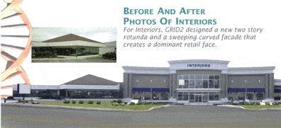
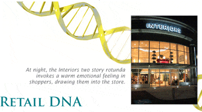
Transforming a storefront exterior can be a hugely rewarding endeavor for furniture retailers. Interiors, in Lancaster, Pennsylvania; Kornmeyers HomeSmart, in Baton Rouge, Louisiana; and Oskar Huber, in Lawrenceville, NJ, come to mind as examples of how retailers can revise outdated to outstanding. In each case, the retailers used new architecture to supplant existing storefronts – without relocating or leveling the original buildings. Interiors, for example, conveys a dramatic nighttime presence with its two-story clear glass atrium spilling soft, yellow light down to street level. It is an ambient luminescence that invokes a warm emotional feeling in shoppers, especially when its cold outside.

Storefronts are the eyes of the store, and, if inviting, can help draw customers in.
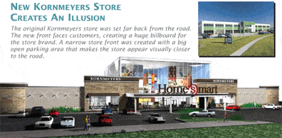
At Kornmeyers HomeSmart, 50-foot high photos feature people who are obviously enjoying their furniture and living spaces. These are visible to car riders passing on the busy road below. Who doesn’t relate to a kid jumping up and down on a sofa? The images imply: people like you are welcome here.
New facades can be more than false fronts. Inside an atrium entrance, incremental square footage may be used to accommodate lifestyle merchandising concepts and signature furniture galleries. Other companies poised for growth may adjust floor space more significantly. It is increasingly common to see stores doubling in size, some to as large a footprint as 40,000 square feet. A word of caution is advised, however, as consumer studies suggest that retail stores exceeding 100,000 square feet have lower success rates. The good news is that even at their biggest, the larger retail spaces are moving away from box-type looks, with new space segmentation techniques and improved floor layouts with way-finding paths that lead customers through the stores with ease. Specialized areas for interior design help, customer rest and refreshment, and sharply priced items are common additions. Clear identification of these areas, with consistently designed signs, guide consumers to each department, and create more opportunities for stores to reinforce the brand message.

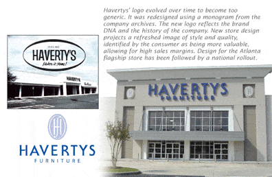
Creating appeal in every aspect of the store, from outside to in, is the key to driving store traffic. Haverty’s Furniture can vouch for this, as the company continues to grow since its store redesign in 2000. From whitewashed walls that looked more like a car showroom than home furnishings store, to shining glass partitions that make a supreme style statement, the Atlanta-based retailer underwent a radical transformation to good results. Even more than the absence of ambiance, it was a sense of impermanence in the original buildings that inspired designers to select the brick porticos as a key design element.
These serve to reinforce the impression that Haverty’s Furniture is a business built on a solid foundation, like hometown banks and other commercial bedrocks of the community. Customers want to feel like they belong. Get them in and get them to come back.
Brand Power
Small-scale floorplans can make big brand statements too. Norwalk’s 80 franchised furniture stores throughout the country fall into this category, occupying about 4,000 square feet each. The stores have earned a quiet reputation for their decorating and interior design services. It was decided that Norwalk needed to focus on ways to more broadly communicate that service expertise to the consumer. Under development, this will be accomplished in part with an updated brand identity, contemporary graphic elements, and the use of fashionable color schemes. For the store exteriors, unique awnings will feature elaborate fabrications expected to immediately command the attention of the public, and reflect on the store’s core competency and unique point of view. All of these elements pull the customer into the store to see what is inside. And each is used to reinforce the Norwalk brand so the customer can readily make that connection in her mind.

Brand names, logos, and attention getting graphics are every retailer's vital communication tools. Used outside on the storefront and inside throughout with consistency, a thoughtful brand strategy has the power to grow your business. Consider your storefront and identity as the first stage in the battle to move consumer traffic through your doors.
Martin Roberts is an internationally acclaimed design industry veteran, with over 40 years of credits for retail and product design. His most respected work is included in the permanent collection of the Museum of Modern Art in New York.
Throughout his career, Roberts has placed special emphasis on the role of branding and marketing in his work. In 1991, Roberts’ launched GRID2 International, a specialized design firm that incorporates scientific methodology to inform the design process.
With his staff of brand strategists, retail planners, art directors, graphic designers, web designers, environmental and industrial designers, Roberts leads his firm in interpreting brand DNA to the target consumer. The results can lead to increased customer loyalty and improved sales. GRID2’s projects with Borders, American Leather, TUMI, and Pathmark, are only a few examples of the success of Roberts’ tenets to empower customers to buy more, more often.
Roberts’ previous works included such nationally and internationally renowned corporations and brands as Bank of Boston, Barnes & Noble, Cartier, Chase Manhattan Bank, Coach, Duty-Free Shops, General Foods, Johnson & Johnson, K-Mart, Marriott International, Nestle, Perrier, Samsonite, Thomasville Furniture, Timberland, and Wal-Mart.
Before founding GRID2, Roberts’ professional affiliations included membership in The Royal Society of Arts (London), the Society of Industrial Designers, and the Institute of Store Planners. With a BA in Industrial Design Engineering and an MA in Design Systems, Roberts has also served as an adjunct professor of Design Management at Parsons School of Design.
Questions on any aspect of retail branding or store design may be directed to him at mroberts@furninfo.com.