SCRIPT FOR YOUR SEMINAR: The Fabric Of Our Lives:
What a fantastic quote. Too bad our sofas, chairs, and custom upholstered headboards can’t keep from wearing out. The grief of rough kids play, happy and excited pets, and general family use seem to rip at the hearts of our soft home fashions. Well, we all probably know we can’t keep it from happening completely, but maybe we can try to slow down the process of the wear and tear on our furniture investments. Armed with knowledge about fabrics, we can make good buying choices when it comes time to replace what we have. These choices should be based on how long a piece will last, as well as on the fabric weaves, patterns, colors, and textures that will really please us and beautify our spaces too. So let’s begin our “fabric education”.
Fabric is a Style Setter
Fabric is more than just a basic supply staple attached to our interior furnishings. Fabric offers many opportunities to design our homes with purpose and intent. Strategically using fabric in our interiors is one of the best ways to add style, color, pattern, texture, and overall beauty to a space. Fabric gives life to a room, and adds a sense of warmth and comfort unlike anything else.
Get ready to learn both how to use fabrics and how to identify them. Of course it is not really ESSENTIAL to know how to identify types of fabrics and types of fibers. After all, you are homeowners and not professional decorators.
Still, there is a certain satisfaction in knowing that we had a part in the planning of our home fashions, and that we cared enough to learn some of the basics regarding the materials used in our home. In this session, we will first learn how to select and use fabrics in interior spaces, and then we will do a little “fabric vocabulary” so you can easily identify many common fabrics used in interior design, and become the savvy “fabric expert” among your decorating enthusiast friends.
Use Fabric and Pattern in Your Interior Design
As you probably know, much of what you will build in the way of room design will involve fabrics. Fabrics add elegance and sophistication to a space, and they soften hard lines. They can add visual warmth to heat up the design, or visual coolness to calm it down. Everything from upholstery and slipcovers, to bedding, window treatments, table accessories, and throw pillows involves fabric. Here are a few concepts that will help you to expertly design your spaces by choosing the right fabrics for your home.
Decide What Will Stay and Go
When trying to decide on a room style or theme, fabric can be the best place to start. Look at the room you will be working on, and make a decision on which pieces will stay in the room and which will go. Of course, starting fresh when designing your space is ideal, and will give you many options for creating a completely new and exciting style and mood. You may want to purchase all new pieces. More than likely though, you may have a piece that you must keep in the newly designed room such as a sofa, chair, or pair of draperies. If you know you will be working with an existing upholstered piece or with fabric window treatments, for example, use this fabric as a starting place to decide on other fabrics and elements for the room.
Main & Accent Fabrics
If you love the fabric on the piece you are starting with, then find accent fabrics to compliment it (more on how to approach this task a little later). If you do not care for the fabric piece that will stay in the room (such as a spouses favorite chair), use it as an accent fabric and find another fabric to focus on, such as a solid, a subtle jacquard, or a textured chenille that blends well with that accent piece.
Wall Paint Colors
It is always easier to select fabric first, and then paint. It is much simpler to match the paint to the fabric than the reverse, especially since paint is readily available in custom colors that can be mixed in just about any paint store. You can even bring a swatch of your fabric (or a finish from a surface) to a paint store to coordinate or match paint, since most paint stores have an electronic “color eye” used to make a match. You can select your fabrics, and paint your walls while your furniture is being ordered or upholstered.
Fabric Colors in Design
Before you actually begin choosing and putting together your selection of fabrics, you need to know how the fabric colors you choose will be represented in your design.
Warm vs. Cool Colors: Warm colors are active, upbeat, exciting colors such as red, orange, and yellow that “advance” or “step out” into a space and let themselves be known. They are the “extroverts” of the color wheel, powerful and inspiring colors that can dominate the space if not controlled. With warm fabrics, a little goes a long way.
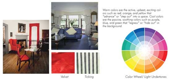
Cool colors are passive, soothing colors such as purple, blue, and green that “regress” or “hide out” in the background, not allowing themselves to be too obvious. They are the “introverts” of the color wheel. They are quiet and soulful colors that can help to calm and restore the emotions and spirit. The darker shades of cool colors can be depressing if they are blatantly overused.
Light vs. Dark: Light colors tend to make a room seem open, airy, and expansive. This is why people typically use lighter colors in small rooms. A darker tone of the right color can, however, give great impact to a small room and make it feel very inviting.
Dark colors can help cozy up a space, and make an overly large room feel smaller. Dark and light fabrics used directly together add contrast to design.
Using Contrast: Many of the most expertly designed rooms that exhibit amazingly pleasing color palettes, involve contrast, a noticeable division of line. Rooms that provide contrast are interesting, and we don’t tire of them quickly. There are a number of ways to get contrast in a fabric palette. One is to use light against dark such as black and white. Other examples include light teal with deep rose, or light tan with rich, dark blue. Dark against light creates this noticeable division of line we call contrast.
Contrast adds interest to design. Three ways to bring contrast into a room through your fabric choices include:
1. Light vs. Dark.
2. Complementary Fabric colors.
3. Split-Complementary Fabric colors.
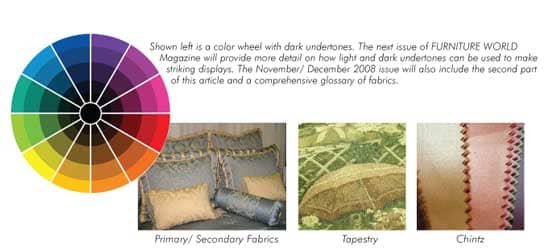
Another way to get contrast is to use colors on the color wheel that are either directly across form each other, called COMPLEMENTS, or colors that are one away from being directly across from each other, known as SPLIT COMPLEMENTS. Such color palettes give the greatest amount of contrast and therefore keep us interested. Some examples of complementary palettes are the use of red with green, purple with yellow, or blue with orange. Split complement examples include red with either teal (blue-green) or lime-green (yellow-green), indigo (blue-purple) with either yellow or orange, and gold (yellow-orange) with either blue or purple. The undertone (derived from white, brown or black added to the original color on the wheel), or the lightness and darkness of the color doesn’t determine whether or not it is a complement or split-complement. True red coupled with true green for example are just as much complements as are apple red paired with olive green (these are complements with brown undertones) or cranberry red and emerald green (these are complements with black undertones).
When using a complementary or split-complementary palette, you can still throw in a hint of a third (or even fourth) fabric color here or there.
A good rule of thumb for a single room or space, that includes paint, fabrics, furniture and room accessories, is the 60-30-10 rule. This means that 60 percent of a room’s color should be represented by a main color family, 30 percent of the room’s color should be represented by a second color family, and 10 percent of the room’s color should be represented by still another color or color family.
You can use various shades, tints, and undertones within each of the three color families. Factor your fabrics into this general formula. Keep in mind though, that the 60-30-10 rule is a GENERAL GUIDELINE and not a design law! Color palettes of 70-25-5 work just as well.
Again, the 60-30-10 rule is a guideline to get you started. This means that you can get spunky and throw a hint of a fourth color family somewhere into the space if your “gut” agrees it looks good. Have fun with this, and trust your instincts.
Find Your KEY Fabric
It may feel overwhelming to find the right fabrics for a space you are redecorating. Even just selecting fabric for one piece such as a new sofa or chair can be intimidating, especially if you don’t understand how they fit into an overall fabric palette. How many patterns should you use, and in what amounts? You may question which patterns will work together. Even when a professional guides your choice, you might be unclear regarding which direction to go.
I suggest that you first find a main fabric, also called a “key” fabric, for the largest piece in your space, such as a sofa, upholstered headboard, or set of dining room chairs, and then begin to build the design around that fabric. This key fabric should be one that you really love. Ideally, it should also be a solid texture, tone-on-tone, or subtle weave in either a deep, rich, or neutral color that will ground the space and become a backdrop for other, more decorative fabrics that can add “punch” or make a design statement without taking over the space. Don’t make the mistake of making your largest upholstered piece the focal point of the room by using a loud or heavily patterned fabric. Large upholstered pieces are the room’s anchors that give stability to the overall design. They can remain even when the less permanent small furnishings and accessories around them are changed out over time.
Next issue
The next installment will give you additional seminar material on choosing supporting fabrics, using pattern, color, texture and scale... plus a useful illustrated glossary of terms. If you absolutely can’t wait, email editor@furninfo.com to get the text via email.
Margarett DeGange, M.Ed. is a Business and Design Coach in the Home Fashions Industry. She creates and delivers custom training programs for managed businesses and their sales consultants to help them communicate better with customers and increase sales and profits. Margarett is a Writer and Professional Speaker, and the President of The DeGangi Group and The DeGangi School of Interior Decoration, with both on sight and on-line courses in Interior Decorating, Marketing, and Redesign.