The color of walls in our displays and in our customers' rooms can either show off or blend in with wood tones and upholstery.
The Colorful Life by Margi Kyle, ASID, IDS, WCAA, WFCF, DCI
Are you aware that approximately 60% of all consumer buying decisions start with color as the most important factor? Color speaks to our emotions and affects us on a visual and non-visual plane. Some colors make us feel warm, happy and full of energy, while others have the opposite effect.
For those of us who are interested in room design, the color of walls in our displays and in our customers' rooms either show off or blend in with wood tones and upholstery. This effect is influenced by the choice of colors that have black, brown and white undertones.
Before we delve into this aspect of color, we should note that a lack of color knowledge is the cause of more lost sales than any other element of design knowledge.
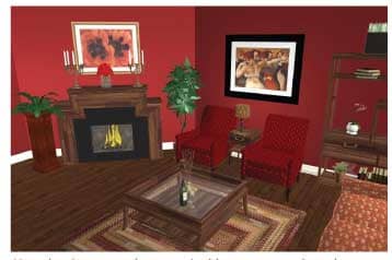
Use the brown undertones (gold, orange, red, red-orange, magenta and brown), to conceal wood tones, because wood tones blend into brown undertones. Rendering created by 3Dream.net, for retail and design professionals.
Clients today are not always shopping for the best price. In fact, a recent study by Integrity Survey Center, a company that specializes in doing furniture store customer surveys found that only 19.2% said that price was the most important factor (the study is posted to the news section of the furninfo.com website). Quality and service rated higher, and sales associates and designers who understand color and know how to use it can deliver excellent service and a quality result (a beautiful room).
Over 40% of paint sales are made because the wrong color was selected first. That is great news for the paint industry but not good for those of us who sell home furnishings. Nothing terrifies a client more than the fear of having to work with color. So let’s look how the color of walls and furnishings affect our customers’ spaces so that we can make the process of creating a beautiful room less scary for our clients.
Let’s assume that your client just purchased a formal dining room from you with dark rich wood tones. If you are also helping your client to choose paint colors or are reworking displays in your store, you don’t want case goods to blend into the walls so that it is hard to distinguish between the wooden pieces and the wall. When you want to show off wood, a contrast of black undertone colors should be used.
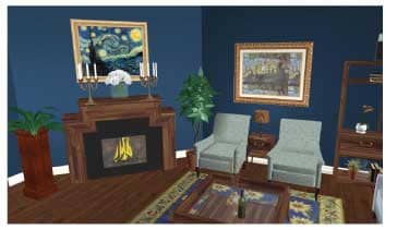
Black undertones (blue, green, purple, black and indigo) enhance wood and make them come alive. Rendering created by 3Dream.net, for retail and design professionals.
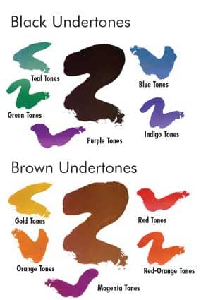
Colors that have a black undertone are: blue, green, purple, black and indigo. These black undertones enhance wood and make them come alive. If you have a client who just installed new wooden cabinets in her kitchen, one of the black undertone colors will work best.
When black undertones are used, the space will appear larger. The lens behind the retina flattens out and the space appears larger.
Now, let’s look at the brown undertone, and how using it affects room design. These undertones are warm and comforting. Almost everyone feels good in this color palette. The brown undertone colors are: gold, orange, red, red-orange, magenta and brown. Use them to conceal wood tones, because wood tones blend into brown undertones. This is a great trick if the wood is inexpensive, distressed, unattractive or much to large for your customer’s room.
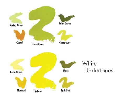
White undertones come from Yellow and Lime Green. The Dewey color system takes the vibrant color of yellow and adds white to get Pale Yellow, brown to yellow to get Mustard, and black to yellow to get Moss. Add white to Lime to get the white undertone, Spring Green. Add brown to Lime Green to get Camel and black to Lime Green to make Palm Green and Chartreuse. Dark woods look amazing next to these colors. The lighter the wood tones, the more they will bend into colors with white undertones.
As was previously mentioned, if you are designing a store or showroom, use black undertones behind case goods. This will make them stand out, so they can be seen clearly. Also consider covering upholstery pieces in solid tones to better show the lines of the furniture. Again, set them against a contrasting wall color with black undertones for maximum visibility.
Importance of lighting
While you are making all of these color choices, remember that lighting plays a major role in color visualization. Every room should have a mix of different types of lighting. It is best to play with the lighting at night and see the effect of the color under artificial lighting.
In rooms with lots of natural lighting, early morning light will be “warm” (enhances red). At noon, the natural light becomes cool (accentuates blue). In early evening the lighting gets warm again, and then the room will be seen under artificial lighting.
Since most homes have incandescent or fluorescent lighting, it is helpful to note how these sources affect color.
•Incandescent lighting: Most incandescent bulbs project a yellow or orange cast that enhances reds, oranges and yellows. Blues and greens will gray out. More expensive incandescent bulbs such as the Reveal brand, provide a more balanced color rendition.
• Fluorescent lighting: Cool white fluorescent lighting enhances yellows, blues and greens. Warmer colors tend to gray out, however, fluorescent bulbs are available that provide different levels of color rendition. In his excellent article, “Store Lighting - Part 2 - It’s All About Color!” (posted to the news section of the furninfo.com site), Monte Lee looks at how the color temperature and color rendering characteristics of bulbs affect how color is seen. Color rendition (CRI) is measured on a scale of 0 to 100. Inexpensive fluorescent bulbs of the type often used in offices having low CRI well below 70. These are not ideal for displaying colors. In addition, these bulbs can cause faces to appear bluish and unhealthy (give a sense of unease and may decrease sales and productivity). Care should be taken to display furniture in the home and especially in your showrooms to best effect.
Conclusion:
Without light there is no color. Work with both and enjoy the wonderful feelings they both bring to a space. Life is too short to live in a colorless world.
Note: We not only see colors but we can also feel them and their vibrations. I invite FURNITURE WORLD readers to go to http://www.wemakecoloreasy.com and take a color test. I am a “red/purple/black” and what it said about me was totally right on the money. It is free, fun and very informative.
If you need more assistance with color, go to www.wemakecoloreasy.com, and find out about a two day course. Enjoy and have a colorful day.
Margi Kyle ASID, IDS, WCAA, WFCF, DCI, has contributed to this industry as an Interior Designer, Television Host, Mentor, Keynote Speaker, Educator, and Writer.
Her columns and advice pieces have appeared in newspapers and magazines throughout North America while hosting TV shows such as “The Designing Doctor,” “Let’s Build” and “Desperate Design.”
She currently travels extensively as an industry speaker on design topics for Hunter Douglas Window Fashions, 3Dream, Greenhousedesign and We Make Color Easy. Her speeches and seminars deal with important topics; Difficult Clients, Technology for Powerful Presentations, color direction and the Power of color, to name a few.
Currently, Margi is Executive Director for WE MAKE COLOR EASY. A two day program that teaches Designers the Dewey Color System along with the scientifically proven Personality test from “Embrace Hue You Are” by Dewey Sadka.
She also owns a growing Interior Design business in North Carolina where she works with Clients and their Interior Design challenges on a daily basis.
Questions about the topics covered this article or on any other interior design issue can be sent to Margi Kyle care of FURNITURE WORLD Magazine at margi@furninfo.com.