
It is a fact that well over 50% of the active shoppers in the US constantly use their smartphones to search, research and buy while on the move. This number is increasing rapidly as more sophisticated phones, lighter tablets and faster networks proliferate the marketplace. Having a desktop-only website along with ads in local newspapers will not reach this emerging group of digital consumers. It is critical that you build a robust mobile marketing strategy which will enhance your brand message and drive more business through your door.
You’ve seen customers walking around your store with their phones. They are researching your competitors and making sure they are getting the best deal. Smartphones empower users to find the information they want, when they want it.
If you don’t have a mobile presence equal to or better than your competitors’ sites, potential customers may choose not to visit your store first. However, if they do visit your competition first, and while there find your easy to use and compelling mobile website, they may well decide to pay you a visit. Industry statistics indicate that over 70% of mobile users skip to the next site after a poor mobile website experience (Source: Neilsen 2012) and smartphone shoppers want more mobile-optimized product information while they’re shopping in stores. (Source: Moosylvania, 2013)
GET ‘EM IN THE DOOR
How do you get consumers into your store in the first place? Traditional advertising channels such as print, TV and radio have suffered double digit declines. Digital ads tied to social media campaigns optimized for the mobile consumer are successfully taking up the slack. Not only are these ads more cost effective than traditional channels but they are a mobile user’s preferred method of engaging with your brand.
This article will give you real, actionable tactics to address this massive mobile marketing opportunity.
Furniture Stores Going Mobile Checklist
Two approaches have emerged over the last 18 months as best practices in establishing a mobile presence. The best approach for you depends on the products and or services you offer.
But, before we discuss your options it’s important to understand how mobile users are different than Desktop or Tablet users. Their needs, motivations and behavior are unique, and your solution needs to mirror this.
Mobile Users are looking for very specific features:
- Action oriented experiences: Get to the point. Mobile users generally don’t like to read lots of detail. They are impatient, hungry, shopping or on some mission that needs quenching.
- Fast results: The site has to load in under 7 seconds or three quarters of consumers are off to your competitor.
- Easy to follow Graphical interfaces: Creating a compelling and engaging experience pays off because its cool, and mobile users don’t like to read or type. +80% of shoppers use phones versus tablets due to the convenience factor (Nielsen 3/12).
- Location services: Step by step directions with maps and Click to Call are very valuable.
- Easy Signup: Whether it’s email or social media, it needs to be push button simple.
- Finger friendly: Use buttons to tap and swipe versus using a mouse or full keyboard.
To fully meet the needs of the mobile consumer, sites must be designed to incorporate all these features, which are less important to the desktop or tablet user. Content, context and engaging experiences are critical to capture their attention and business.
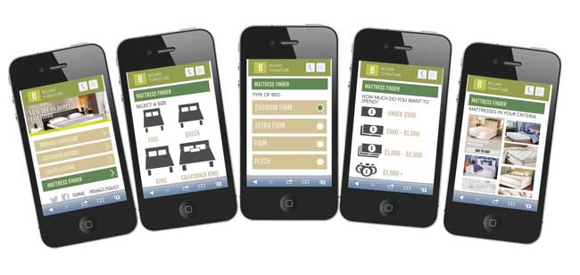 Mattress selector gives mobile viewers product categories to choose without typing. As potential customers touch the graphics, the system focuses on the appropriate mattress choices/ vendors.
It’s shocking, but in my personal experience, many owners or senior managers haven’t looked at their website from their phones, while 50% or more of their customers do! We all know the benefits of being a secret shopper. Try going to your phone, call up your website in the internet browser to see your mobile presence first hand. If you see a desktop site on a small screen then you’re not meeting the needs of today’s consumer and chances are you are losing sales to your competition. Check them out on your phone too and then read on.
The images that accompany this article represent a sequential mobile experience that meets the needs of a mobile user shopping for furniture. Here the shopper touches graphics and is lead down a series of logical questions until a product matching his or her answers is recommended.
The selection process simultaneously fills out a form as the user selects graphics. The form is then emailed to the customer service department to address next steps such as setting up a design appointment with or contacting the consumer to complete a sale. We have used this approach from cosmetics to auto-glass and find it to be very engaging. You simply don’t find these experiences on desktops.
Technology Choices
As referenced earlier, there are two industry approaches to mobilize your website:
- Mobile Optimized Sites: Build a separate Mobile Optimized version of your desktop site.
- Responsive Web Design: Rebuild your entire website using technology that responds to each device’s screen resolution.
Mobile Optimized Furniture Sites
A separate Mobile optimized site can be very effective when designed and built to specifically meet the needs of the mobile consumer. These are consumers who have elected to follow your brand, as well as new potential consumers who will find you on the web. As stated previously, well over 50% of the active shoppers in the US constantly use their smartphones to search, research and buy while on the move. This number is increasing rapidly as more sophisticated phones, lighter tablets and faster networks proliferate in the marketplace. Having a desktop-only website along with ads in local newspapers will not reach this emerging group of digital consumers. It is critical that you build a robust mobile marketing strategy to build your brand and drive more business.
In developing such a site, the first step is to find an experienced mobile web provider who understands:
- The buying process for your products.
- What is the effectiveness of mCommerce.
- What your short and long term objectives are for mobile marketing.
- How customers find you today.
- What they expect of your brand.
- The mediums and resources available.
- What your competition is doing.
- The key value of your brand.
The mobile web designer should lay out an experience to meet the needs of your brand, your mobile users and help drive more business.
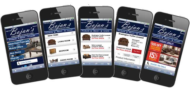 Bojan’s Furniture & Outdoor Living is a mock up of a mobile site that includes a host of mobile optimized features that you will want to consider. Graphics load quickly along with text, pricing, and buy-now content that feeds from an existing POS/ inventory management/ eCommerce software system provider. The site provides single button access to advertised specials, new item listings, the ability to browse furniture, step by step directions, social media and coupons.
Above is a site design focused on providing actionable data to get customers to visit a store because most consumers want to size, sit upon, touch and envision the furniture in their homes. Actionable data in this context is single button access to advertised specials, new item listings, the ability to browse furniture, step by step directions, social media integration and coupons. An interesting fact is that redemption rates for mobile coupons are 10 times higher than traditional rates at approximately 20%. (Borrell Associates 2011)
It is important to note that much of the content in this design is fully dynamic. For this example, the content is from direct feeds (automatic streaming data) from a central computing ERP system so that changes on the desktop site are fully reflected in the mobile site automatically.
Once the mobile site is complete, a simple rule is added to your desktop website that recognizes when a mobile device is attempting to reach you. When this happens, the mobile user will see only the mobile version of the site without having to type in a different web address. It’s a completely seamless and automated process.
Considerations: If you are happy with your current desktop website, then consider a Mobile Optimized site which can be implemented rapidly and at low cost. The focus of this site is to speak to the mobile consumer which often includes experiences not found on the desktop. A separate site, done right, should not present a maintenance problem. Plus it can be tightly integrated into your back-end systems and feed content from an existing eCommerce or ERP system enabling automatic content synchronization.
Responsive Web Design: Responsive Web Design (RWD) has emerged over the last 6 or 8 months as an approach for businesses that are ready and able to redesign their entire web experiences to take advantage of mobile. Often this includes scrapping an existing desktop site design so new programming techniques can be used.
RWD is already proving to be a great technology that promises to address every consumer screen size with a single website. This includes desktops, phones, tablets, TV and any other devices. The system is built to detect the screen size of the device accessing the website. Delivered content is then automatically reconfigured to fit the screen. For illustrative purposes an example of a Responsive site is shown on page 24 (all rights are that of the site owner).
The appeal for RWD is clear. You only need to build a single website with a single code base to support any and all devices. This is an IT Manager’s dream, but there are downsides. The main disadvantage is that since you are effectively building your entire web experience from scratch, you will incur additional costs and time before you can take your business mobile.
To build a website using RWD, you typically begin by redesigning your desktop website to conform to the special rules that RWD demands. Your website will need to break down into components in a column type structure that will resize and reposition elegantly based on the screen size.
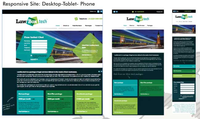 Above is an example of a responsive site (all rights are that of the site owner). At left is the Desktop Site with full layout. When the screen size is reduced, note that the header image adapts to fit, and information boxes are shuffled. The content is not missing, just redeployed. When made the width of a phone at right, the information boxes collapse to fit the screen.
Notice that the illustrated site has a certain structure to it which is common to RWD. It contains a header with a menu, main image across the top of the page with end to end boarders coordinating with a body of text beneath, and then multiple, but segmented topics in boxes or containers. This is a well laid out site with clever styling to create a good experience for the user of multiple devices.
Today the big picture is, RWD is ideal if you want strong support for the desktop and tablet user, but presents complex challenges as the screen is reduced down to a phone.
Therefore, a review of the type of product, services and/or experiences required to maximize engagement is required. There are some industries where the decision to go RWD is simple. For example, the law site shown on the previous page is a good fit for RWD because users go there to read-up on the latest info and generally do not need to interact.
To be clear, RWD is maturing at a rapid pace, and as with many technologies what is difficult today will be an easy standard tomorrow. Again, take a look at your needs and the state of your current desktop web presence. That will help clarify your path to adapt the right technology.
RWD Considerations: The primary considerations when opting for RWD as opposed to a dedicated mobile experience are:
- RWD downloads and reformats the desktop site to conform to the screen size. This could well mean downloading a full desktop worth of content to a mobile device. Therefore, you must pay attention to what is actually getting downloaded to the mobile device. If your desktop site is graphic or video intensive it may take much longer than the 7 seconds a mobile user is willing to wait. As a general rule, a proper mobile optimized site will be about 15% of the size of a desktop site so it can load extremely quickly.
- RWD is inherently a “jack of all trades” approach. It is easy to spend time designing for the device without thinking through the mobile user experience. What works on a desktop does not always work on the mobile device. RWD will rarely reduce large bodies of text. Often, RWD simply reformats text to fit the smaller screen. Mobile users end up having to scroll through all this text to find something useful.
Summary: As with all marketing initiatives, the objective is to optimize the results of any investment by reaching more targeted prospects and turning them into customers. Make sure your prospects can find you. This takes a solid mobile presence and requires that you match the mobile experience to how your consumer prefers to engage with your brand and consume your products/ services.
If this community of mobile users is lost to you, act to capture them by creating an experience that will engage them.
Your choice is simple. Either build a dedicated mobile site that presents experiences not found on your desktop site but relevant to your products and services, or rebuild your entire web experience from scratch and tweak it for the Mobile user. In either case, make sure you are dealing with a seasoned mobile designer who understands what makes mobile users respond.
About Jay Bojan: Jay Bojan is an entrepreneur and CEO of Wapple US. He and his business partner, Darrell Knight have been in mobile for over 13 years and founded a Cloud based company way back in 2001, when clouds where more weather oriented than they are today.
Wapple has been developing mobile solutions for over 10 years for brands such as Microsoft , P&G , Covergirl, Pantene, American Furniture Warehouse, Bob Mills Furniture, Olay and more. Today Wapple continues practicing mobile first excellence and offers Responsive Web Technology solutions.
Questions about this article can be directed to Jay at 719-330-9697 or
jay.bojan@wapple.us.
Furniture World is the oldest, continuously published trade publication in the United States. It is published for the benefit of furniture retail executives. Print circulation of 20,000 is directed primarily to furniture retailers in the US and Canada. In 1970, the magazine established and endowed the Bernice Bienenstock Furniture Library (www.furniturelibrary.com) in High Point, NC, now a public foundation containing more than 5,000 books on furniture and design dating from 1620. For more information contact editor@furninfo.com.