When evaluating the sales
success of a store’s
inventory, no furniture
store owner should discount the
huge effect that color has on
consumer purchasing behavior.
A bedroom set may sell well in one store but head to the clearance floor in another store just a few miles down the road. This difference in purchasing behavior can be influenced, positively or negatively, by color. That’s why a basic understanding of color in merchandising – including color psychology, color marketing and socio-color information, is critical to practicing creative, leading-edge visual merchandising.
Color as a Motivator
The opportunity to make an impact with color begins with the store’s exterior through attractive signage, plus strategic and innovative window design. The real opportunities, however, lie inside the store.
Consumers are more aware than ever of the latest trends in fashion and home interiors thanks to instant access to information online and sites like Pinterest, Houzz and Tumblr. And, while our eyes are seemingly fixed on the digital devices we carry, consumers still visit physical retail spaces and are drawn to all types of visual communication. In fact, according to a 2004 Chain Store Age article by M. L. Tullman and R. K. Clark, “Revitalizing Visual Merchandising – Restoring Balance to Retail Environment Entails Engaging All Five Senses,” customers in the retail environment are affected by visual communication 80 percent more than that of our other sensory organs.
Creative color combinations and comprehensive trend vignettes significantly contribute to consumer purchasing behavior. Visual cues that assist in the connection of the product, the brand and the experience will ultimately create a stronger sense of loyalty to that product / brand. An effective “presentation” of furniture, includes on-trend colors and accessories that create an impression and provide an appropriate feeling of recognition for the targeted demographic.
Many retailers have found that selling a product is easier when they “sell the ambiance” – and that is achieved through lighting and color. Color draws attention and can influence mood. A 2006 research paper, “Impact of Color on Marketing”, by Satyendra Singh, states that up to 90 percent of snap judgments made about products can be based on color alone.
“Color should really be an overriding piece of the strategy to make things more relevant to the consumer,” says Jena Hall, furniture industry product designer and merchandising expert. “When a consumer walks into a store and it’s all put together for them in a compelling way through colors that complement the upholstery or the finish, it brings everything together.”
Hall notes that retailers often don’t have a lot of walls to work with and, as such, may not be inclined to create vignettes. But creating backdrops, she notes, gives the customer’s eyes a place to rest. And when you are selling by price, fashion and/or quality, and not by the pound, that can make a significant difference, Hall notes.
“Walls are important,” she says. “Vignettes can create an ambiance. Otherwise a consumer walks in and sees a sea of furniture; their eyes can’t focus. Creating lifestyle vignettes marries the upholstery with finished case pieces, and the colors used on the walls are critical. They can kill a collection or they can enhance it. If a store doesn’t have an interior designer on staff, they can work with an advisor or consultant to determine the right tones and shades, rather than just putting up a coat of paint.”
For example, a recent project with a new retail concept for New Jersey based, HOME INSPIRATIONS Thomasville, led Hall to work with Sherwin-Williams to design a color palette. The four HOME INSPIRATIONS stores utilize a variety of lifestyle vignettes that make the products displayed relevant to the consumer, providing diverse looks with a wide range of products. That not only includes the furnitures’ finishes and upholstery offerings but the finishes and colors used on floors and walls.
Allowing consumers to identify the wall colors or wall coverings and the finishes of the floors in this and other retail settings such as Rooms to Go, Pottery Barn, West Elm and Williams-Sonoma allows them to take home the look and feel of the vignettes along with furniture and accent pieces they purchase. Design teams source and select the finishes, often selecting seasonal colors to set the mood.
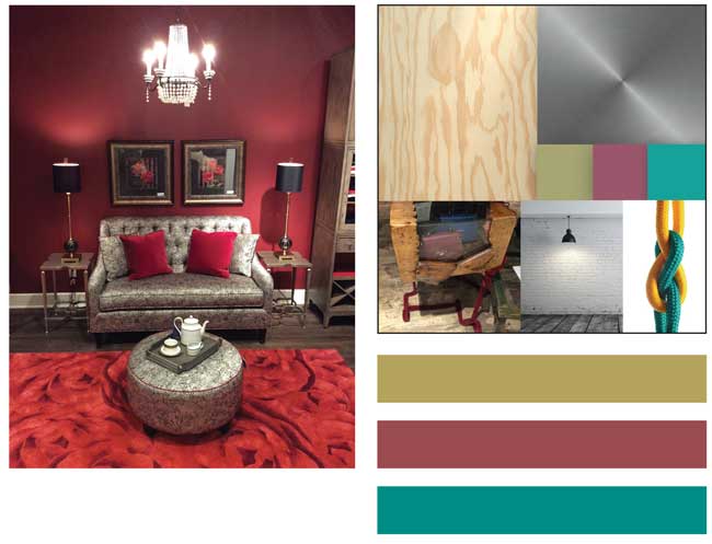 Her Closet w/Chandelier (above): Here’s an idea for a walk-in closet with built-ins. The closet is painted in Sherwin-Williams #SW Red Obsession flat paint. The color is picked up in a rose-patterned flower rug, plus added red accent trim in the ottoman and sofa. The red is married with a grayish stain on the floors, which is also one of the hot trends today . Design by Jena Hall, Home Inspirations store, Paramaus, NJ.
Above, the “Construction Chic” collage has an industrial vibe, using every day materials, neutral tones with some eclectic colors intermixed. It’s edgy. It supports pop-up stores, and transparent business models. Sherwin-Williams colors Edgy Gold, Cordial and Thermal Spring are shown along with plywood and a silver gun metal-type texture, ropes, an industrial looking fixture against a painted brick wall and reclaimed flooring. This look is common in retail clothing and shoe stores, but can be used to create an edgy, industrial look with furniture that appeals especially to Millennials and Gen X.
Strategic Color Selections
Making color selections in a store work to the retailer’s full advantage is part of the overall process. Strategic color selections tie it all together to create a lifestyle experience that speaks to the consumer.
Some basic examples show the need for pairing colors appropriate to the pieces and styles.
Consider, for example, a mid-century modern walnut wood furniture collection. This would show well paired with iconic mid-century hues of mint, pale pinks and grays on adjacent walls, in accent rugs or even in live greenery combinations. Now, consider the same furniture with neon green, purple or electric blue color-blocked walls. The effect would be completely different and unlikely to be well received. Neon colors are not an appropriate pairing with the period furniture, and the targeted demographic would not relate.
Brightly colored product or very ornamental/visually “busy” product requires only a simple “canvas” of a neutral, light gray to allow the product to stand out and not be disruptive. Consider how art galleries design their spaces and light subjects. Simple shapes pair nicely with the subdued color as well.
A rough-hewn collection of wooden furniture with casual textiles and accessories that have a re-purposed feel will merchandise best with colors and lighting that share the same ethos and mood. Stay with warm, soft effects and colors, and finishes that don’t communicate cold and sterile; no gilded walls or silver leafing should be found here.
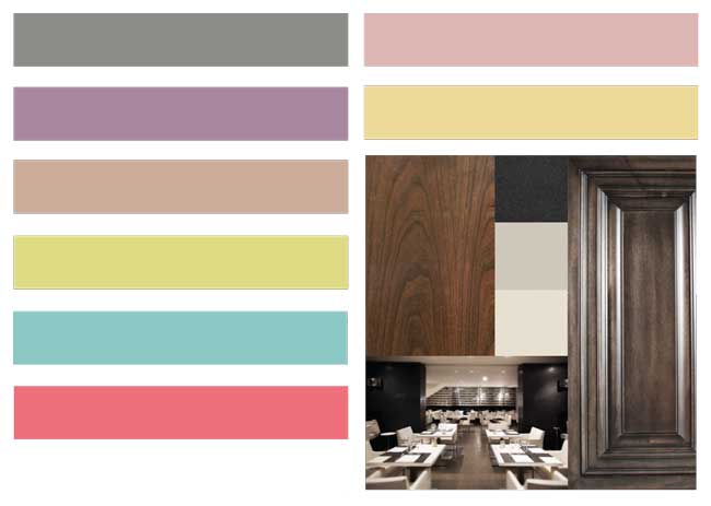 Shown above are colors from Sherwin-Williams that could be incorporated into a Mid-Century Modern display theme: “Classic French Gray”, “Radiant Lilac”, “Pinky Beige”, “Pink Flamingo”, “Appleblossom”, “Sunbeam Yellow”, “Chartreuse” and “Holiday Turquoise”.
Classically Modern image from Sherwin-Williams at right includes clean lines, neutral colors, concrete stone, marble tile and contrasting surfaces that add interest. The grays used in these spaces are warming, and this look supports a museum theatrical looking scene ideal for retail spaces showing, for example, mid century modern furniture. At right, colors shown include a black which is a powder coating on metal, plus “Worldly Gray” and “Divine White” also from Sherwin-Williams.
Keeping it Fresh
Colors trend along with consumer tastes and desires; that means that retail furniture wall and vignette displays need to keep current to remain effective “silent salesmen.” Some coatings suppliers offer annual color trend analyses, such as the Sherwin-Williams Colormix™, that not only speak to consumers choosing paint for their homes but to furniture and cabinetry designers and retail designers who choose finishes for their products and stores, respectively.
Often, coatings suppliers work directly with product designers and retail design consultants to plan accordingly as product finishes change and retail settings are strategically adjusted. Some of these are even adjusted regionally to take advantage of and meet specific consumer tastes. What may work in the southwest, for example, may be completely wrong for the northeast.
Of course, there are costs involved in any such venture – but it’s best to look at the big picture and consider the expense of developing vignettes and color palettes as an investment in the business. Helping the customer visualize, after all, can help you visualize – and realize – retail success.
About Kathy Andersson: Kathy Andersson serves as manager of Color and Marketing for the Product Finishes division of Sherwin-Williams. Andersson is a chairholder and has been a member of The Color Marketing Group (CMG) since 1996.
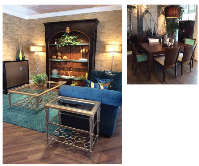 Bibliotheque (left): Color used as a motivator, creates impact making displays more relevant to consumers. This room setting is a small entertainment area. The Ambella Home Bibliotheque bookcase has dark turquoise shelves. Rug is turquoise and teal, sofa in a deeper shade of teal (leaning towards peacock), and case is black with gold leaf accents, a major trend for accent furniture. The gold is repeated on a coffee table, that picks up the same finish as the bookcase accessories and accent table. Walls are covered with textured wallcovering that has a slight shimmer of gold and silver, creating a painted texture effect. Metal tables are by Caracole. Design by Jena Hall, Home Inspirations Thomasville, Paramus, NJ.
Brooklyn Bridge Dining (above) in the same store includes a photo mural of an urban lifestyle,
providing a sense of depth and space in the small room. Distressed wood floor provides an informal relaxed look, a major decorating trend. Table and chairs by Somerton Dwelling.
With over 22 years experience researching trends in interiors and consumer markets, Andersson successfully leverages her knowledge of formulating and application to guide manufacturers through their color and finish strategies process. Andersson is responsible for the division’s global color strategies, design and marketing efforts including color trend research and analysis as well as societal and lifestyle trend monitoring for industry segments consisting of furniture, kitchen cabinets, electronics, wood building products and general finishes for various substrates.
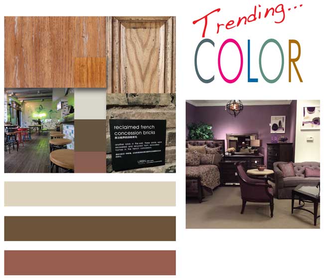
The “Authentic Approach” Look: It’s about, mixed materials and being eco-responsible and transparent in business models. The collage at left includes reclaimed bricks from a concession area. Texture is important here. Patina imperfections, warm colors, matte surfaces, some bamboo and worn looks, and oiled/ waxed oak finishes all mixed and matched together. The overall aesthetic is still fresh and new.
Colors don’t have to be bright and bold when creating an Authentic Approach look, although they can be. Neutrals can be used such as the Sherwin-Williams “Canyon Clay” also shown along with the muted brown “Kaffee” and beige color “Wool Skein”.
There is lot of visual and physical busyness in this setting so furniture should be clean and simple. This aesthetic could work easily with upholstered goods and metal furniture, interesting wall treatments, art and ceiling fixtures. Acrylic and plastic furniture geared towards transitional or contemporary styles might work well.
Harlowe & Finch bedroom by Thomasville: Vignette features a wall finished in a Sherwin-Williams color #SW6270 Soulmate, selected to enhance the room setting of the upholstered headboard, plus the sofa and chair fabrics. Jena Hall notes that walls are important. “Creating backdrops,” she says, “gives the customer’s eyes a place to rest between diverse and competing displays.”
Furniture World is the oldest, continuously published trade publication in the United States. It is published for the benefit of furniture retail executives. Print circulation of 20,000 is directed primarily to furniture retailers in the US and Canada. In 1970, the magazine established and endowed the Bernice Bienenstock Furniture Library (www.furniturelibrary.com) in High Point, NC, now a public foundation containing more than 5,000 books on furniture and design dating from 1620. For more information contact editor@furninfo.com.