There are lots of excellent reasons to consider Adding multi-branded entries
to home furnishings stores to achieve retail objectives.
Shopping for home furnishings has evolved, shifting from commodity-based to
experiential. Furniture customers want to be inspired. Adding separate
storefronts can help retailers to meet or exceed that expectation. At the
same time, it makes sense for many larger-scale furniture stores to create
multiple branded storefront entrances to target new customers and achieve
other brand objectives.
Multi-Storefront Benefits
Adding multi-storefronts makes it easier for shoppers to find products. They
attract attention and break up long, boring facades. Having more than one
branded entry allows retailers to market home furnishings categories more
effectively. They also telegraph to shoppers that retailers are as serious
about a product category as a specialty retailer and are clearly “in the
business.”
Mattresses, for example, are often a “lost” category within furniture
stores. Building a separate storefront with the appropriate signage allows
furniture retailers to compete more effectively with national mattress
brands who position themselves as mattress experts, leading to increased
traffic and higher sales.
Multiple storefronts also:
-
Break down the shopping experience and decision-making into digestible
chunks.
-
Can help showrooms feel more relatable and be designed to target
specific shopper profiles.
-
Differentiate retail brands from competitors.
-
Create a whole home shopping experience when they are grouped together.
“Multiple storefronts can help showrooms feel more relatable and be designed
to target specific shopper profiles.”
Best Candidates for Effective Storefronts
Many home furnishings departments can be converted into effective
storefronts. Best-performing areas and trending categories are excellent
candidates, as are higher-end, designer/custom, promotional price-points,
electronics, appliances and well-known brands.
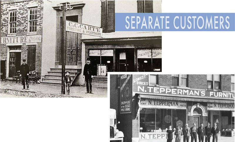
C.C. CARTY FURNITURE & UNDERTAKING: In the late19th century, furniture
and undertaking businesses went hand-in-hand. Separate entrances
catered to customers with different needs.
TEPPERMAN’S FURNITURE: Before the rise of suburban and mall stores n
the early 1900s, Main Street downtown furniture stores like
Tepperman’s in Windsor, Ontario, flourished.
-
Mattresses: Mattresses are one of the most obvious
choices to feature, especially if an established brand name is used.
Mattress First retailers like Michael Alan in Arizona, Kloss in
Illinois, and Sylvan in Idaho use this strategy to create separate
entrances and branding for their Mattress First stores. Prominent
exterior signage attracts lots of attention to these storefronts.
Sometimes, retailers successfully feature well-known mattress brands,
like Temper or Serta, on their storefronts.
Other retailers incorporate the look of a separate storefront in
building facades to promote mattress departments, even if their
customers have to enter through the main doors.
-
Outdoor Furniture: Outdoor furniture may warrant an
exterior entrance in areas where the category can be sold year-round. It
is helpful if the space can be located outside or has access to an
outside area. Miller Waldrop’s new Lubbock store utilizes an existing
courtyard to feature patio furniture. The space is enclosed by a
perimeter fence with a signature portal and metal gate providing direct
access. It also includes a built-in outdoor kitchen to grill and host
events. Rooms To Go’s separate brand, Rooms To Go Patio, is advertised
on the facades of larger footprint stores and sold at smaller
freestanding stores. Their freestanding stores have separate entrances
and storefronts or share entries with Rooms To Go Kids.
-
Outlet and Clearance: Outlet areas with separate
entrances can be especially useful for retailers who want to distance
clearance spaces from established store branding. Outlets should have a
different look and feel, achieved by incorporating natural concrete
floors, exposed open ceilings and simple discount messaging. Separate
outlet entrances are appealing because they attract different types of
customers and don’t siphon off regular customer traffic from main store
entrances. Tepperman’s Furniture, for example, is relocating its popular
outlet space in London, Ontario, from the back of the store to the side
of its main entrance to increase visibility.
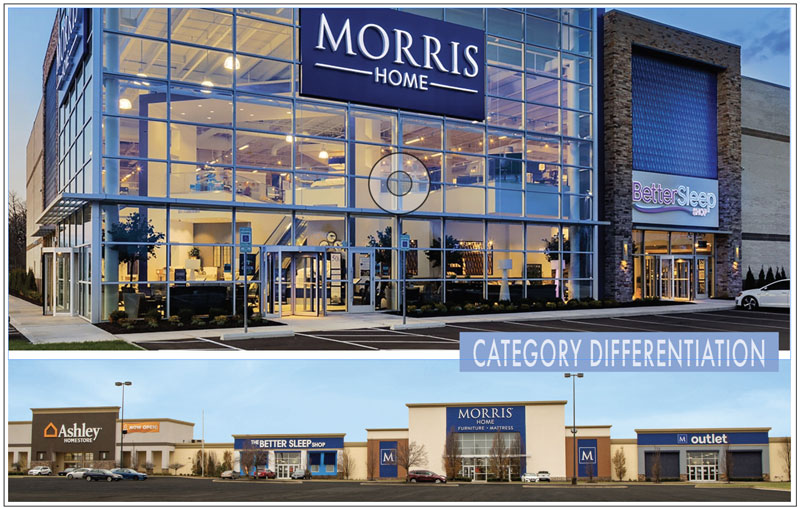
MORRIS HOME: Ohio-based Morris Home was one of the first home
retailers to embrace separate entrances for its most important
categories. These include mattresses, outlets, and Ashley
Homestores. The retailer continues to distinguish itself in each new
market it enters by featuring its Better Sleep Shop prominently on
exteriors.
-
Rugs & Flooring: Rugs and flooring are less common
candidates for separate storefronts but adding them can be similarly
effective. Interiors Home in Lancaster, Pennsylvania, subleases part of
its store to Martin’s Flooring, a third-party flooring supplier. When
run by a third-party vendor, rugs can create a bazaar feel in a space.
Densely displayed rug and flooring displays give customers the
impression that a store takes design seriously. Other specialty
departments such as Spas/ Hot Tubs, Recliners, Electronics and
Entertainment, can also warrant a storefront entry experience.
“Outlet areas with separate entrances can be especially useful for
retailers who want to distance clearance spaces from established store
branding.”
-
Appliances or Custom Kitchens: Other categories that do
well as separate destination storefronts are appliances, custom
cabinetry and custom kitchens. Appliances, for example, tend to be
competitive and price-sensitive categories. Having an appliance
storefront staffed with specialty salespeople reinforces the impression
of expertise and competitiveness. Van’s Home Center, for example,
expanded its store to create separate entrances for appliances and
custom kitchens to display its expertise in both.

KLOSS FURNITURE: Mattress First brand retailers like Kloss
Furniture, which built a separate entrance (below) for M1 at its
O’Fallon, Illinois, store, attract attention and signal to shoppers
that they are serious about the category.
-
Brand Names: It is common to leverage furniture brand
name recognition by creating a separate storefront. Many retailers have
Ashley stores, which, when featured prominently as storefronts, help
drive traffic in specific markets. An example is Missouri Furniture,
which recently built a store in Washington, Missouri. Two-thirds of the
facade is devoted to the Ashley brand. La-Z-Boy, Stickley and Bassett
are other strong candidates for storefronts that elevate a local
furniture store’s brand image.
Promoting style categories rather than brands is an alternative for
retailers that want to promote their store’s brand instead of a
supplier’s. Montgomery’s main store in Sioux Falls achieves this by
having a separate branded entrance for its Modern Furniture department.
-
Design Studios: Another storefront trend is to create
separate environments focused on selling higher price point goods and
custom design services.
Many retailers have Design Centers at the hearts of their stores where
designers sit down with clients, make presentations and review
options—often by appointment. Some, however, are reaping sales benefits
by creating distinct entrances or presenting design areas as separate
stores. This makes sense because design studio clients may respond
better to in-store experiences that are more upscale than those offered
by some stores.
“Adding multi-storefronts makes it easier for shoppers to find products.
They attract attention and break up long, boring facades.”
See additional strategies for introducing various successful Design Center
configurations in furniture stores by clicking
HERE.
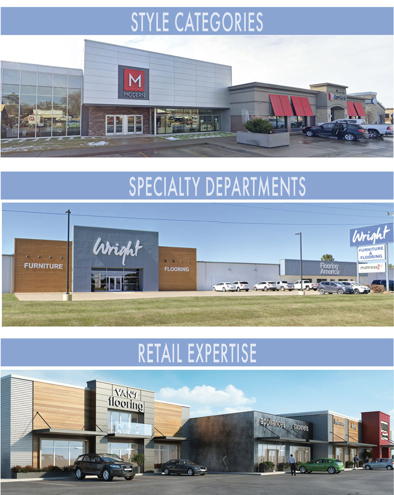
MONTOMERY’S: Style categories such as “Modern” can be used to brand
separate storefronts. Montgomery’s did that at its main store in Sioux
Falls, South Dakota.
WRIGHT FURNITURE & FLOORING: Even home retailers in smaller
communities can benefit from multiple entrances. Wright Furniture &
Flooring in Hannibal, Missouri, clearly advertises its Flooring
America with a separate entrance.
VAN’S HOME CENTER: Retailers like Van’s Home Center in Auburn,
Indiana, that sell appliances, custom kitchens, cabinetry, and
flooring can benefit from separate storefronts that advertise their
expertise.
Special Customer Amenities
Many furniture retailers are experimenting with customer amenity spaces
added to their exterior storefronts, such as cafes or markets. While a cafe
might get lost in many furniture store settings, a separate branded entrance
draws in a different clientele. Furniture Mall of Texas launched its Howdy
Cafe with independent access, exterior seating and workspaces. Dwellings in
Barbados recently converted the center part of its store to a new Mindful
Market concept with a separate entrance.
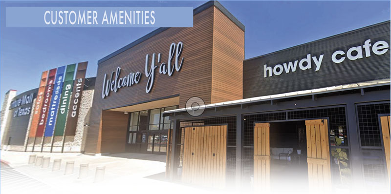
FURNITURE MALL OF TEXAS: Furniture Mall of Texas successfully launched
its Howdy Cafe with a separate entrance and outdoor seating area.
Home Store Campus
An exciting trend for furniture retailers is the creation of “Home Store”
campuses that serve as total home furnishings shopping destinations. The
goal is to attract customers at both ends of the price-point spectrum and
everything in between. Every category of furniture shopper is attracted to
them because they include a main store, an outlet, and a higher-end design
studio. In addition to adding an outlet, design studio and main store
destinations, Mathis Home included a separate sleep studio store and an
Ashley store within their Oklahoma City campus. Their Ontario location will
include a separate café. Other retailers, such as Homemakers, A&W Furniture,
Urban Styles, and others, are experimenting with home store campuses.
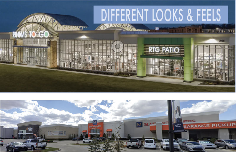
ROOMS TO GO: Rooms to Go (RTG) often advertises its Outdoor and Patio
store as a separate brand on its store exteriors.
MATHIS HOME: At its retail campuses, Mathis includes clearance centers
as separate storefront entrances to attract customers who shop at a
value price point.
Interior Experience Ideas
-
Individual exterior storefronts should be reflected in store interiors.
-
Design Studio spaces should have a higher-end feel with large-scale
walls, generous room sets, featured decor, plentiful fabric swatches,
additional customer amenities and more.
-
Outlet areas can have a basic feel with raw concrete floors, stacked
merchandise and discount signage.
-
A separate Mattress store lets retailers create a more private
experience, such as a soothing spa-like environment.
-
An interior patio can be made to feel more like it’s outdoors by adding
faux trees and typical outdoor finishes like stone and wood.
Once shoppers enter through one of several storefront entrances, keeping
them in the store is important. This can be accomplished by connecting all
of the stores on the interior, allowing customers to explore each space
without ever having to go back outside. Multiple pass-throughs enable
customers to enter one way and exit via another. Depending on the setup,
retailers may choose to build separate customer service areas, each staffed
with a team of experts. Alternatively, they can create a major, centrally
located customer service area to provide service for all store entrances,
supplemented by conveniently located, smaller outposts or lookup stations.
The best way to accomplish this depends on a store’s configuration, size,
flow, and traffic.
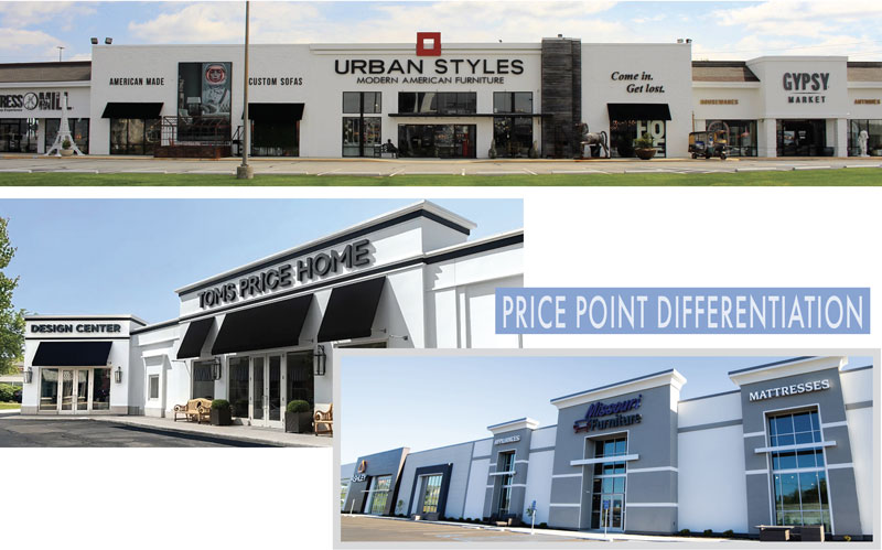
URBAN STYLES: Indianapolis-based Urban Styles created a multi-store
destination, advertising custom sofas and American-made furniture on
its exterior. It also created separate storefronts for “Gypsy Market”
housewares and “Mattress Mill” bedding.
TOMS PRICE HOME: Toms Price Home in Chicago learned that creating a
separate entrance for clientele who are looking for specialized design
services creates a more exclusive experience. It’s a winning strategy.
MISSOURI FURNITURE: Furniture retailers with Ashley stores can
leverage the brand to drive traffic. Missouri Furniture did that with
their new ground-up store in Washington, Missouri, where Ashley
dominates two-thirds of the facade.
Perceived Downsides
Some furniture retailers say that they don’t like managing multiple entries
and find it difficult to adjust their sales “Up” system to accommodate the
changes. However, stationing individual sales experts responsible for
working with customers who enter through a particular store entrance can
help alleviate these issues. Likewise, adding technology can help manage
each door. Cameras, door signals, and phone alerts let associates who are
“Up” know which door the next customer has entered. Some retailers employ
greeters at each entrance to alert sales associates as customers enter.
A few retailers lock some storefront doors and reroute customers to the main
entrance. This is not a good idea because locked doors frustrate or annoy
customers, especially if they park in front of a locked entrance. A better
solution is to create portals with faux windows to give the general
appearance of separate entries. When doing this, the main entrance may need
to be emphasized to prevent customer confusion.
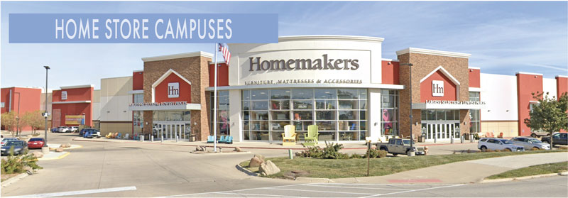
HOMEMAKERS: Some large retailers like Homemakers have created “Home
Store” shopping campuses. The exterior advertises everything from
mattresses and accessories to their separate Clearance Center store,
making it an apparent total shopping destination.
Conclusion
The main benefit of Including multiple storefronts on furniture store
exteriors is the advantage of transforming them into major shopping
destinations. They elevate various categories and attract customer traffic.
They also offer customers everything they want, so they do not need to shop
elsewhere.
Storefronts: A Historical Timeline
Undertakers: In the late 19th century, many funeral
parlors added furniture sales to their mix. It made sense to separate
their client groups by adding a separate entryway for household
furnishings shoppers. Over time, dedicated furniture stores evolved. The
need for separate entrances diminished.
Main Street USA: In the early 1900s. Almost every
downtown included a Main Street furniture store. Most were less than
2,000 square feet with one main entrance.
The Suburbs: As people left cities for the suburbs,
furniture retailers relocated as well, building warehouse stores with
open showroom footprints. These required single entrances to control
traffic flow. The first suburban mall was built in the late 1950s. Malls
featured a variety of stores with multiple access points offering unique
shopping experiences. Suburban strip malls were built, some becoming
one-stop shopping centers with multiple entrances.
Mega Stores: Large format stores like Walmart, Target
and Home Depot introduced multiple storefront entrances as they expanded
into new categories such as grocery and garden centers. At the same
time, furniture stores increased showroom square footage and added
product categories. This created an opportunity for multiple branded
store entrances to target new customers and achieve numerous other brand
objectives.
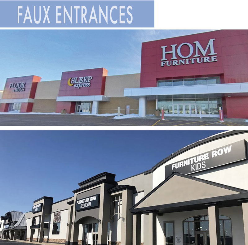
HOM FURNITURE: The exterior concept for the HOM Furniture location (above) includes a main entrance larger than its Sleep Express, Floor & Rugs, and Seasonal Concepts storefront entries.
FURNITURE ROW: Furniture Row established its entire brand concept as a multi-store experience that advertises each product category, from dining to bedroom to kids and others separately.