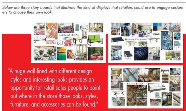
We continue Furniture World’s Design & Designers series with an interview with Libby Langdon, president and creative energy behind Libby Interiors, Inc. Besides being familiar as a makeover television personality, Ms. Langdon is an author, product designer, and frequent contributor to leading magazines such as Architectural Digest, Better Homes and Gardens, House Beautiful and others. She also partners with a number of manufacturers to create her own lines of accent furniture, lighting fixtures, outdoor furniture and rugs.
Growing Up In The Business
“We know your roots are in High Point, N.C., did growing up there influence the scope of your design activities?”
“Growing up in High Point, surrounded by the furniture industry, pointed me in a direction towards interior design and product design. My mom is a designer and my dad was in textiles. Mom definitely had a talent for design, color and pulling things together. Dad sold textiles: his job focused more on the commerce side, but still with a focus on the design elements. I guess that these design and commerce characteristics are just in my blood – a combination that drives my business life.
“What’s fascinating is that when I left the North Carolina home-furnishings design bubble, it was an eye-opener to see how people really live.
“It’s one thing for a creative person to want to make everybody’s house pretty, but as a design professional, it’s necessary to pay the bills. When you start an interior design business you have the idea in mind that it’s all going to be creative and fun – but you also need to think about the business side.
“I think my early life both piqued my interest to design on my own, to design home furnishings, setting me on the path to what I do now.”

A Multi-Faceted Approach
“With all of your activities, how do you balance the various aspects of your design life?”
“There are three components to what I do. The first component is my interior design business. Sometimes we will make over a whole house, and other times we just make over somebody’s living or dining room. This part of the business is a lot of fun. There’s nothing quite like the feeling of leaving somebody’s home when the installation is complete. The client is just going crazy, loving the way their home looks, and not believing that they could have ever imagined it on their own.
“The second component to my business is media, which is also fun. I’m a contributor for House Beautiful magazine, and I do makeover television. I started out in makeover television, which had a huge impact on how I approach interior and product design.
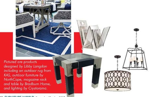
“The third component is designing furniture, designing lighting, and rug collections, as well as accessories and accent furniture. Presently I’m working with Bradburn Home, lighting with Crystorama, my outdoor furniture collection with NorthCape, and rugs with KAS. For the last six years I’ve also designed upholstery for Braxton Culler.
“All three elements of my business inform each other. It’s an exciting time.”
Three Little Words
“In past interviews with designers we have gotten the sense that some of their designs flow from an underlying theory of how life should be lived. It does not appear that you design that way. Where do your designs originate?”
“There are three words that embody who I am and what I do on all fronts: easy, elegant, everyday style.
“‘Easy’ design is approachable, not too stuffy, fussy or uptight. Designs should be fun – our homes should feed us. A home can be very comfortable and still be ‘Elegant’, stylish and chic. ‘Everyday’ is for my clients’ lifestyles. They have friends who drink red wine, have pets, and kids. They like to entertain. Their rooms should reflect their lives and lifestyles.
“Easy, Elegant, and Everyday is what real people across the country need. I learned about design for real people and real life from doing makeover shows and working with clients. I’m not trying to teach anybody a design lesson; I just want to give them a space that they adore, that they come home to, that gives them a big hug.
“My product design is very much influenced by my interior design work. I’m motivated to create pieces that I can’t find for clients in the marketplace. I don’t feel like I specialize in one corner of the design world. My clients may need contemporary, classic, traditional or transitional. It’s fun and interesting to try and work with lots of different styles.”
Learning While Doing
“You grew up immersed in the design world, did you get a classical design education or did you learn on the job?”
“I do have a foundation in color, texture, fabric construction, and so on from FIT in New York. But my real education began when I hosted a show on Fox called Design Invasion. They gave me twelve hours to make over a space I’d never seen in person. I did have some bad cellphone pictures taken by an intern, a few measurements and $6,000. That’s where I really learned about design, and that was where I learned about connecting with people and the consumer.
“It was fascinating to go into people’s homes, everywhere from Texas to Illinois to Maryland to Pennsylvania and Florida. That was when I knew that I wanted to design product to give people what they needed. Let’s face it, it’s makeover TV, you’re starting with a place that looks pretty bad, but what was amazing was what a huge difference you could make with a small amount of money, and in a very short amount of time, with just help from a production assistant and a handyman.
“The cool thing about the show was that the people didn’t even know I was coming. At 7:00 am I would do what was called a ‘knock and shock,’ knock on the door and say, ‘I’m Libby Langdon! I’m here to make over your living room!’ I scared them to death. Oh, it was so cool, and so mean. But usually everybody was really excited.”
Challenges For Retailers
“Turning to the retail aspect, we would like to get your thoughts on where retailers could improve on everything from bringing people into the store to helping them achieve the designs of their dreams.”
“The average consumer can easily become overwhelmed when they visit retail furniture stores. Their experience convinces them that they can’t possibly design their own space – so they hire a designer.
“I think there is an underlying thought with retailers that it is best to give consumers a million choices. Yes, there are some customers that know exactly what they want, but most customers don’t want to go through 1500 fabrics and try to pick something out. It is my experience that presenting too many choices just locks most people up. I think that trying to take some of the guesswork out of making choices is how retailers can boost sales. There are a couple of approaches that help people to know where to begin.
A Picture Is Worth…
“Sometimes, instead of asking people, ‘Hey, what do you like?’ I ask them, ‘What do you hate?’ Oh, my gosh, that’s a question that’s so much easier for them to answer.
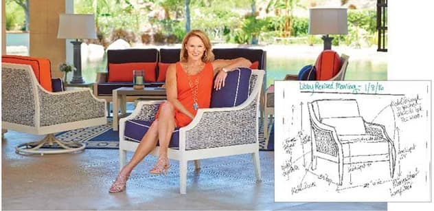
“I think retailers could devote one area, just one wall in a store, to display storyboards showing different lifestyles, each linked to a particular place – maybe Santa Barbara, or Siesta Key, or wherever. The storyboard should incorporate the colors, fabrics, and furniture they sell. Consumers can begin making design choices by relating to a location to which they have a connection. That connection helps the sale to get off on the right footing.
“We all know that a lot of people don’t necessarily want to talk to a salesperson. They just want to look around – ‘Oh, no, I’m just browsing.’ But a huge wall lined with different design styles and interesting looks provides an opportunity for shoppers to see, and for retail sales people to point out where in the store those looks, styles, furniture, and accessories can be found. Even if a store cannot fully set up actual vignettes based on the story boards, there is still a benefit to giving shoppers a strong idea at the start of the sale.
“Consumers are savvier than ever before; they are used to seeing beautiful furnishings shown on website like Pinterest, Houzz and 1stdibs. So, even if a consumer doesn’t want to engage with a staff person right away, they will be able to visually connect with a snap shot that sets the tone for how they might want their room to look.
Design Partners
“Another powerful thing a retailer can do is partner with interior designers to create a designer seminar series. This raises the awareness of the designer, connects the designer to the retailer, gives the retailer something to promote and something to talk about. In-store events are a great way to raise awareness, and to also give retail social media promotion teams some pretty good fodder, leading up to an event – and following it, as well.
“I can’t tell you how many times I’ve gone into a paint store and have seen people standing there looking at a wall of paint colors, just completely overwhelmed. At all levels, it’s important for manufacturers to supply ideas and take guesswork out of the process. Designers are a great resource at this level also. For example, when I show my lines at the High Point Market, I like to show them the way I think retailers will be able to sell them. I explain, ‘This is what I’ve created, this is what your customers want. Just take the ideas and recreate them in your stores.’ When manufacturers have a designer collection, they should use the designer, not just show the products.
Telling The Story
“And finally, I would like to see the home furnishings I design be merchandised beautifully. Telling a story is very important. Doing a good job of presenting, even on a modest budget is almost like doing a low-budget makeover. It makes a big difference and gets significant results.
“Often the right kinds of retail product promotions are lacking as well. Right now, because of social media, it’s easier and less expensive to promote products and designs than ever before.
“There is business out there. Interior designers are all swamped right now – we can’t take on any more work. That shows that consumers are there and they are looking for solutions, and buying. I believe that there is a big opportunity for retailers to partner with or align themselves with designers. It’s a win-win for everybody.”
Sales Partners
“What advice would you give to retailers about hiring and educating salespeople?”
“Education is important, but so is motivation. To be successful, salespeople need to have the right tools. In-store design studios, where customers can sit down and can learn about the design process can be very effective. Even if a store doesn’t have a licensed designer on staff, having magazine images, samples, and boards raises a retailer’s design profile and helps the retail staff as they’re working to engage customers and promote products. Customers should be encouraged to bring in images they’ve seen online or in magazines, and then the salespeople can just bring the design experience to them on a silver platter. Retailers just have to roll up their sleeves a little bit. Most of these kinds of initiatives really don’t cost much.”
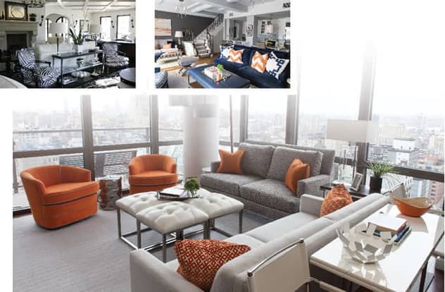
Small Space, Big Style
“Making a big statement in a small space has become representative of your style. How did that come about?”
“Being a designer on the HGTV show Small Space, Big Style, was an eye-opener for me. I compiled so many small space tips that I decided to write an interior design book on that topic. That process helped me start to focus my story, which is about helping people to live in a beautiful, stylish way.
“The book included, of course small space tips, [see page 84] but also just tons of regular design tips. When the book was about to be published early in 2009, the economy was totally in disarray, and the publisher at the time said, ‘This might not be a very good time to release a book.’ And I was like, ‘Are you kidding me? This is the perfect time; people are downsizing, they’re not able to move into bigger spaces.’ Then I did a makeover on the Rachael Ray show where I could only use paint, and timed the launch of the book to when the show aired. It was off and running.
“My philosophy of small spaces is that living without so much doesn’t mean living without luxury. Sometimes living with less is the ultimate luxury. We’re definitely seeing a trend toward downsizing. Do people really need a cavernous area between their foyer and their kitchen where nothing’s happening? In that respect, I think people want to simplify. So, whether we are talking about millennials who would rather spend their money traveling, or baby boomers trying to figure out how to incorporate pieces they love when they move out of a large home, just about everyone can use some help with creating small spaces.
“For the furniture industry as a whole, small spaces are a great way to tap into so many different consumer demographics. It’s just incredible. Most people don’t necessarily want to live in a shipping container, but I believe that we’re going to see this trend continue.”
Layout Is The Key
“What are the challenges that ‘small’ creates for both manufacturing and retail?”
“Working on a smaller scale is a challenge that can be overcome by using smart design. What most people don’t understand is that a good layout makes a room look 500 times bigger than an unfurnished space.
“When confronted with the challenge of designing a small space, some people will just put in one sofa and say, ‘Oh, that’s all that can fit in here.’ But the space can probably fit two end tables, two well-proportioned chairs and some ottomans – keep it mobile.
“I remember going through one of the most dynamic displays I’d ever seen at an IKEA store. They had literally taped off and furnished different sized areas to show shoppers what 200, 400, and 800 square feet could look like. The rooms looked so much bigger than what shoppers might have thought possible. Any way our industry can find ways to share information about design and good layout in a creative and fun way, is a really good place to start.
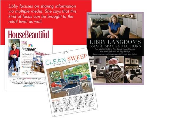
“That’s how I approach my work. The focus on sharing information has helped me to grow as a business. It works, whether it’s doing a TV makeover or writing a book, a column, or giving people tips. And this kind of focus can be brought to the retail level as well – and be incredible!” '
Trends To Watch
“Are you seeing any interesting trends with your interior design clients?”
“It’s interesting – there is a total mishmash of clients. We have baby boomers, millennials, for sure, and Gen X-ers, definitely. A couple of current trends that may end up being short-term are the use of bold plaids on larger scale upholstery items and the resurgence of the very traditional Chesterfield sofa style. It’s a classic fabulous sofa shape that’s reaching a younger audience now. People want an eclectic mix, for sure, but I think it’s more than that. They are looking to include something classic in their rooms. For a while we saw Bohemian looks, which now seems to be including different classic cultural elements, such as Moroccan or Mexican.
“Color-wise, we are going to see more slate gray. Let’s face it, gray’s here to stay. Just like tan never really went away. And more slate blue, a mix of indigo and a gray that both men and women respond to.”
Buying For The Long Term
“Do luxury goods still have a place in a decorating scheme?”
“Luxury goods have now become synonymous with quality. People are looking for things that last, if they can afford it. They want things that they’re going to really like for a long time and, when they find it, they’re willing to pay for it.
“The much younger ones aren’t feeling like they need to be attached to purchased items for a great length of time. I think that the younger people, however, who are already spending money and investing, definitely want the design to be evergreen and last for a long time.”
‘Smart’ Design
“With so much talk of ‘smart’ design, do you see smart furniture coming into its own?”
“Technology definitely affects how we live in our spaces, and, without a doubt, smart homes are going to become the norm. But I don’t think people really want smart furniture.
“Technology has changed the way we sit in our furniture. I know that sounds crazy, but a lot of my younger clients don’t sit on a sofa, they half lie down. Watching screens, big screen TV’s, tablets, iPads, and other tech for long hours has changed the way that people sit on their furniture – the way they use their furniture.
“When I meet with a client, I ask them, ‘When you watch television, do you like to put your feet up on an ottoman, or curl them around your ankles and put them up on the sofa? Do you like to lie sideways?
“When people tell me how they sit in their furniture, it allows me to more easily find them just the right piece. If somebody likes to lie sideways on their sofa and watch TV, a roll arm is probably a good idea – a track arm is probably a bad idea. From a sales perspective, this little bit of insight can let customers feel like you’re tuned into them, like you’re listening to them. Honestly, I feel like I’m a good listener first, a problem solver second, and then third, an interior designer.
“Just getting as much information as you can really, really helps make the best space possible. I may ask, ‘Do you like to entertain? Do you have a dog? What color is the dog’s fur?’ In many retail situations the staff may not want to play 20 questions, but there is information to get from people to help them make the smartest purchases for their lifestyles.”
Three Things A Week
“What haven’t we touched on yet?”
“Setting goals. I am a big goal-setter. I set one-year goals, two-year goals, ten-year goals…that’s a really big part of what I do, and why I think I’m able to continue moving forward. Goal-setting gets me thinking about what I can do better; where else I can go; how I can grow. The best way to start chipping away at those things is to set goals. My mantra is, ‘Three things a week.’ That is, if I do three things every week to reach towards a goal, I’m probably going to get there.
“That idea can translate to retailers. Seen as a whole, big issues are overwhelming, but by chipping away at them – three things every week – the tasks become manageable. Retailers can design more and better promotions, increase media exposure, do a major website update, create a design lab….
“I am super lucky with the companies that I partner with: we work in tandem to do outreach to get results. For companies whose audience is not there anymore, the challenge for them is to craft a new story, find a new audience – one that is spending money.
“The work is out there. The consumers are out there. Success is just a matter of getting the story out there as well.”
Libby’s Top 10 Small Space Design Mistakes
You Can Help Your Customers Avoid
1. Leaving walls white. White walls won’t technically make your space larger and they lack personality. Spice up your space, have a little fun and paint some color on your walls!
2. Using large-scale furniture. Oversized pieces can hog square footage, but using better-proportioned furniture can allow you to create a more functional and comfortable living space.
3. Lack of light. Not lighting your space effectively makes it look smaller, if you can’t see an area in your room it’s as if it’s not there! Capitalizing on natural light and bringing in artificial light is imperative.
4. Using short shelving and cabinetry. Using full scale shelves and cabinets that go all the way up to the ceiling visually draw the eye upward making the ceiling seem higher and your space feel larger.
5. Keeping clutter. Holding onto too much stuff and not throwing away clutter can make even a large space feel small. When in doubt, throw it out!
6. Using small-scale accessories. Large lamps, artwork, candles, vases and accessories create the appearance of greater space and more height. No wimpy lamps!
7. Not using mirrors. Mirrors reflect light, whether it’s daylight or lamplight, and they visually make your space feel larger by adding depth and dimension.
8. Not capitalizing on your wall space. Think vertically and get your walls working for you! Mount shelving or storage systems up on your walls to display collections and store items so you don’t waste precious table space. This will also help focus your items in one spot so your space feels more organized.
9. Using all wood furniture. It makes a room feel clunky and bottom heavy, but by mixing in glass-topped tables with wood pieces you give your room a lighter, airier and more open feel.
10. Using small area rugs. A small area rug can look like a postage stamp and make your room feel cramped but using a large rug creates an extended visual line and gives the illusion of more square footage.
Furniture World is the oldest, continuously published trade publication in the United States. It is published for the benefit of furniture retail executives. Print circulation of 20,000 is directed primarily to furniture retailers in the US and Canada. In 1970, the magazine established and endowed the Bernice Bienenstock Furniture Library (www.furniturelibrary.com) in High Point, NC, now a public foundation containing more than 5,000 books on furniture and design dating from 1620. For more information contact editor@furninfo.com.